Questions & Answers

Used color indicators + named colors + other color picker improvements

+324 votes
5,130 views
asked Jan 3, 2016 in Studio One Feature Requests by Scoox (17,270 points)
edited Sep 11, 2017 by Scoox

I often find myself struggling with quickly finding identical colors for different tracks/channels/events. It would be quite helpful to be able to easily see which colors have already been used. How about displaying a small indicator on colors that are currently in use in the active song? Here's a mock-up of what this might look like:


This way it would be very easy to locate "that yellow I just used on Track 2" rather than having think "the 4th from the top and 3rd from the left". The indicators would take into account all areas of the song, so for example if all tracks are blue and there is a red media clip, then both blue and red would have the small indicator on them. In the above mock-up the indicator is either black or white depending on the background color so as to maximize visibility.

Also useful would be the addition of named colors, so you could just pick "Drums" from a list and have the track automatically be set to the color that, to your taste, best represents "Drums" (I always use a dark shade of brown for drums, for example), rather than having to manually hunt for the color ("was it that brown or was it that other brown next to it?").

This could be implemented as follows:

Left-click on the color button to bring up the normal color picker as currently implemented

Right-click on the color button to bring up a context menu showing all the available user-defined named colors, listing the actual colors and their respective names. At the bottom of the list there is an "Edit list..." option which brings up a small window where users can re-order (move up/down), add, remove and rename their named colors.

This is what I mean by "color button":


Named colors would be globally available across different projects.

Finally, it would be nice if the automation curve color picker was exactly the same as the normal color picker. As you can see, the automation color picker only presents a subset of the main color picker:


Furthermore, some colors which appear to be the same are actually not:

17 Answers

+2 votes
answered Jan 7, 2016 by Rico Sergeant (990 points)
I think this would be useful
+7 votes
answered Jan 10, 2016 by niles (54,650 points)

It would also be nice to see a color ID/Name/value when hovering (not needing to LMB/RMB click) a color in the color map. Additionally it would be nice if we could use that same box for entering/pasting a value. It could be something simple like this:

+13 votes
answered Jan 10, 2016 by Scoox (17,270 points)
edited Sep 11, 2017 by Scoox

Can you elaborate what you mean by "color name" and "color #" ? Do you mean standard color names such as "Green" or user defined color names such as "Drums"? Do you mean RGB color code or a numerical ID relative to the color position in the picker?

Other things I have noticed:

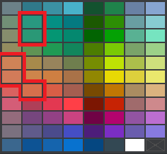
1) Some colors are too similar, and in my opinion not very useful. For example:
2) The small 3x6 color picker looks, at first sight, like a subset of the big 8x11 picker, but when you look closely the colors are not the same:
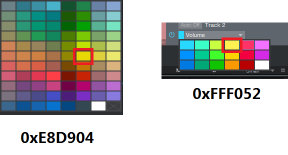
3) In the big picker, colors are arranged in some sort of semi-random fashion. For example, reds are scattered up and down and left and right. This makes it very difficult to tell apart similar colors that really should be together. The order used in the small picker makes more sense, because each column contains different shades of the same color.

THE SOLUTION:

1) User-defined picker: The current picker gives us 88 colors to choose from, but most users probably don't need more than 20 colors in any given project. So, allow users to customize the color picker, including number of rows & columns, and which color goes in which cell. Any RGB color should be allowed, ideally allowing users to manually supply RGB values to define colors. This solves problems 1), 2) and 3) above.

2) Single color picker: Use the same color picker everywhere, not a big one and a small one.

3) Store color picker as part of the song file: Users can then create song templates that use their custom color palette. This ensures portability when opening old projects or opening projects on different computers.

4) Use RGB: The color palette can change at any time. A given project may use colors that are no longer part of the palette (e.g. the user has modified the palette), and that's fine if colors are referenced by their RGB value. In addition, users should be able to click a "..." button, maybe at the bottom of the picker, to manually select colors that are not in the palette, like in Excel:
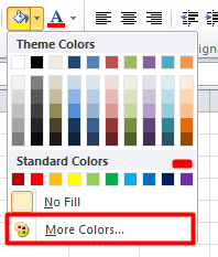
5) Allow color palette import/export: This would be useful for exchanging palette presets, and for backup.file.

NOTE: If this FR is too much hassle to code, initially you could just provide an import/export palette function, so that at least power users would be able to create their palette using a text editor and import it afterwards, and share it with the community.

+6 votes
answered Jan 11, 2016 by niles (54,650 points)
edited Jan 12, 2016 by niles

answer by Scoox By color name or number I mean anything that is unique for that color. I don't really care if it's a HEX/RGB/HSL or (random) name or number. As long as I can see it when hovering the color (in the color map). So when I have a track that is a certain color, I can open the color map for that track to identify the used color after which I can pick/type it on another track that I want to color the same.

Edit: Below is the default color picker from Cubase, as you can see I can quickly identify the green color as #10 (or any name I give it) to use on the other track. That's so much easier than needing to compare colors.

+2 votes
answered Jan 11, 2016 by Scoox (17,270 points)

@niles I don't see anything wrong with that and I suspect users who use Photoshop (etc) would feel right at home seeing some RGB codes or whatnot when hovering over the colors. Having said that, there might not even be any need for text cues if we had customizable color palettes, as I described in my earlier post, because finding your way around a reduced color palette is usually easy enough.

+2 votes
answered Feb 5, 2016 by Scoox (17,270 points)
a little bump
+3 votes
answered Aug 22, 2016 by chrisdepalma (820 points)
What about being able to set up color favorites by instrument type? Say drums = brown, bass = green, guitar elec = blue, etc... maybe show these favorites beneath the color picker palette?
+1 vote
answered Aug 22, 2016 by Scoox (17,270 points)
@chrisdepalma Please read the whole original FR. This was already proposed as "named colors" which is exactly what you are saying :)
+2 votes
answered Apr 10, 2017 by AlexTinsley (925,250 points)

Thank you for the feature request. 

If anyone else agrees or disagrees, then please vote it up, or down. 

To vote:

In agreement click on the little blue triangle pointing up.

In disagreement click on the little blue triangle pointing down.

The developers pay close attention to those that are voted on the most. 

You are allowed one vote. 

Just viewing and agreeing but not clicking on the vote does not help the issue. 

Please click on one or the other. 

+5 votes
answered Sep 21, 2017 by kirkwhetton (550 points)
The studio one colour palette is awful, I support all of those ideas. They would make a welcome addition to colouring and arrangement purposes.
+1 vote
answered Oct 8, 2017 by stephenmizer (760 points)

While my idea from LMike's suggestion thread uses the existing color grid, these are some excellent ideas too.  Surely SOMETHING from these two threads would be far more useful than this murky paisley mess we have to use now.

+1 vote
answered Dec 20, 2017 by joeljossie (5,340 points)
BUMP because it's been almost 2 years and nothing has changed. Love Studio One, but these colors need some work! I love all of the ideas in this thread.
+4 votes
answered May 22, 2018 by Scoox (17,270 points)
edited Feb 13, 2019 by Scoox

So.... Studio One 4 has arrived and the color picker appears have been rearranged, and yet it's the same old set of colors in random order. Seriously, what was the point of that at all? With the v3 picker, though pretty bad, users had already memorized color positions. S1 v4 offers the exact same set of colors but in a different order—now users have to ditch their muscle memory to learn yet another equally terrible picker. If you are going to change something, at least make it better, not worse!!!

+2 votes
answered Feb 13, 2019 by risotto (2,250 points)
I really would love to see an improvement or just simple changes here.
Normally me personal doesn't use more than 4-8 colors per song and I normally would really like to have always the same color coding, just for organizing stuff. As an example drums in blue, guitars  in green and so on. And I mean the same, not a slightly different blue because I couldn't find the color. I also like to color my busses the same as the tracks and it really drives me mad if I can't find the same color.
It would be sooooo great if I could store a personal palette of colors just to get rid of the different nuances. And if it would be fancy and awesome I would really appreciate to have the ability to give them personal names depending on their use.
+5 votes
answered Feb 13, 2019 by Scoox (17,270 points)

Reaper has track auto colors—track colors are automatically applied based on the track name. Maybe Studio One could get that too, here's how I'd do it:

  • In the color picker, have a "special" color, kind of like a wildcard color (perhaps marked with an "A" to indicate "Auto"). When this special color is picked, the track is colored according to a set of basic rules defined by the user.
  • Newly created tracks have automatic color preselected.
  • Users can override automatic coloring by selecting a different color from the picker, thus the traditional manual method is still available for users who prefer that.
In the Settings window, users would define their colors and the auto-color rules, kind of like conditional formatting in Excel:
  • Users can create and delete rules as required (+ and - buttons next to list)
  • Rules can be moved up and down in the list after being added (Up and Down buttons next to list)
  • After creating a rule, uses can pick a color by clicking the color field.
  • Entries with an empty "Rule" field are ignored.
  • In this example, tracks containing "drum" in their name would automatically be colored brown, and so on.
  • When a track name satisfies more than one condition, the condition that is satisfied first (from left to right) applies. For example, "bass drum" matches both "bass" and "drum" but "bass is matched first as the track name is parsed from left to right, therefore "bass" applies (red)
  • The greediest match always wins, for example (see pic below), a track named "Jon's bass drum 2" would match "bass" first. Then Studio One would look among the rules to see if there are any other rules containing "bass". In this case we see there's the rule for brown "bass drum" which also matches. Because "bass drum" is greedier (consumes more characters), the track will be colored brown.


  • In cases where a tie occurs, for example, if the user types the same rule twice, the rule that appears first in the list (the one nearest to the top) applies.
How about that?
+1 vote
answered Aug 19, 2019 by hitwriter (1,530 points)
A broader pallet would be awesome as well... :-)
+2 votes
answered Jan 8, 2021 by patrickhuitema (2,490 points)
edited Jan 8, 2021 by patrickhuitema

Until 2020 there was no colour palette improvement implemented  ... and this remains one of my biggest frustration in studio one 5.1:

  • No "customize colour strip" option?   
  • Colours spread randomly on the colour strip, no colour sort option.
  • This is now fixed by Trucky's (externally developed) script

The current colour picker is unsorted and therefore not intuitive to use. The dinosaur of DAW " pro-tools" has a better colour strip .. C'mon PreSonus are you really not able to improve this?

Other users bypass this "lack of PreSonus development" and released: Studio One 5+ colour toolbar script.

Colourtoolbar small version:

Colourtoolbar large window:

...