The relatively recent addition of the Show Page and Perform features in Studio One offers up some wonderful possibilities. And based on tutorials from Gregor it seems a very promising feature which I am now using. However, it is clear that the design of the Show page had a particular type of playing in mind. One where one or more Artists are playing against one or backing tracks. While this is certainly very common it forgets the fundamental type of playing, with no backing tracks.
When using the show page in a non 'play' or transport mode the interface becomes one of patch management, patch manipulation and song balancing. Take for example using something like a B3 Instrument. In order to have control over the instrument, the player needs access to several drawbar controls and the Leslie speed switch. For the Player, the very layout of the controls can be a helpful indicator.
The present model for the Show page is one where the Controls apply to the entire show. This places a severe limitation when you have 20 patches and for each one, you have 3 to 4 params you play with while playing. It would be far more powerful if Controls could be assigned to a Patch along with a secondary group that is for the song/show.
Therefore, split the Controls into two regions, the Patch region and the Song region, as illustrated below. Obviously, this would take a model change as now each Patch must support a control group object.
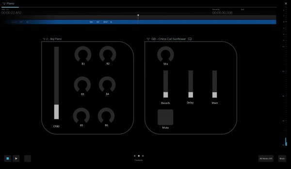
As can be seen in the above image the Patch dropdown menu is now above the section that contains the controls for the patch. On the right are the song controls with the song selector immediately above. The artist drop-down has been moved to the left leaving the top bar clear. The more central location for the patch and song would also make it easier to select via a touch device.
In order to provide the flexibility to create the layouts, the Control Design window would need to be modified as well. Below is a basic idea of how it could be constructed.
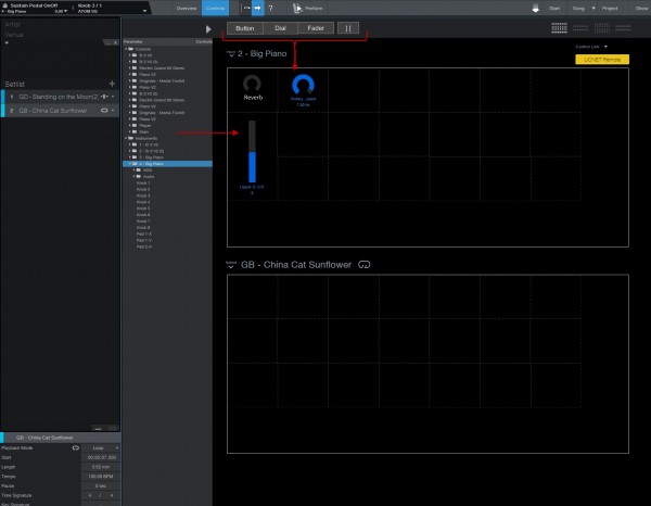
Above is an image displaying the controls interface of the show page with an example layout.
As you can see the present default layouts are still available on the top right. However, on the left can be seen buttons that would allow you to drag the control into the Patch or Song/Show Region. This would allow the user to create the layout they need versus having a bunch of controls that are not needed.
Note also a space control in order to provide some layout control. To make life simple a simple grid system can be implemented. As can be seen above the Dial and Button would take up a single square but the Fader takes two vertical squares. A space would take a single square as well.
Logically there should be no limit to the number of controls the user can place given they would already be restricted by their interface of choice when using the Remote Device. This is another reason to allow for custom layouts. For users that only have a phone as a surface being able to set it up for your device screen resolution is key. This would also broaden the appeal of the tool.
You will also note that I have moved the standard parameter tree to the right. This is to encourage users to drag and drop. Note the large grey arrow above would be to minimize the control surface and display the full stand parameter assignment dual column display.
This model also fits with Presonus's standard of more than one way to solve a problem. The user can drag from the parameter list onto a region square and the default control will be created and the parameter name assigned to the label. To change the control, if an option, the user could simply drag the control type from the top bar and drop it. Similarly, the user should be able to drag from the 'Click and Drag' container top left of the screen.
I feel this feature request would significantly strengthen the Perform and Show pages and possibly open it up for more users. Greater control on a per patch basis makes the Perform Control screen becomes a PART OF THE INSTRUMENT. Now instead of searching the dark for the right knob to turn, the tablet resting right there in front of me now becomes something I play. As I solo with my right, my left is swiping the pad and doing all sorts of fun stuff, this is what PERFORMANCE means.
EDIT ADDITION 1
It should be noted that if the user does NOT create any Patch Controls there is a problem with this design. The natural thing to do in this case would be to only the Song/Show Controls. However, this would leave the Patch Dropdown no place to go! So in retrospect placing both the Song and Patch Menus back at the top would be more fitting and consistent with the other two tabs.
In fact, the best solution would be to introduce VERTICAL scrolling on the Controls tab. So swipe up and you will see the patch controls. Swipe down to return to the song controls. This would work extremely well because in the future if you wanted to split the song and show controls it would simply be another vertical swipe. So the Swipe Workflow would be thus.
