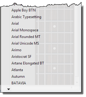
@brianmeisner1 Technically speaking, the font list is not a window but a semi-transparent popup menu:

As you can see, the bottom arrow of the menu is not displayed because the height of the popup menu is calculated wrongly because I have a desktop toolbar attached at the top of my screen. When I temporarily remove the desktop toolbar (which I will not do permanently), then the bottom arrow is displayed:

The Windows API offers several methods to calculate the desktop height, obviously Notion does not take into account the correct desktop height because of the desktop toolbar and by using the wrong API call.
HOWEVER, selecting a font by using such a popup menu is a COMPLETELY WRONG design decision because it is very INEFFICIENT: It took me OVER 4 MINUTES to scroll down the whole font list!!
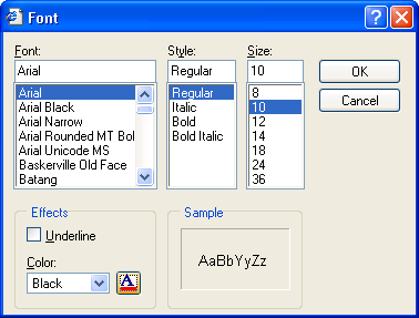
On the Windows platform, the standard method for selecting a font is a FONT SELECTOR DIALOG which is provided by the Windows API itself, for example:

This API call has several options for the elements to display in this dialog. This method of font selection is much more efficient than the popup-menu currently used by Notion.
Look here for example:
https://msdn.microsoft.com/en-us/library/windows/desktop/ms646958(v=vs.85).aspx
Please forward this to your development team.
(In addition of being a musician I am also a software engineer with a lot of experience in the field of user interfaces)