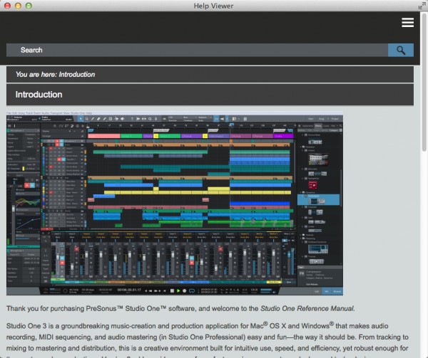
It looks quite nice, with the new layout, but I'm feeling tied up & slowed down with the new reference manual for Studio One v3.
1. The search results should highlight the word I'm searching for, both on the results page, and on the destination page of each result, as it does in the v2 pdf. I have to trawl through each resulting page by eye, to search for the relevant part - in my case I searched the word "cache". Pretty tedious as it was on the last page of the "timestretching" page. In v2 I can see immediately where the word occurs, and decide whether it's relevant or not.
Also, once I've gone to one of the result pages I can't go back. I have to retype the search. in the v2 pdf all the results were in the left hand bar so I could click on each one to quickly find the relevant info.
2 - I miss the page numbers, which let me know where about I am in the manual.
3 - Us older lads & ladies don't all have such great eyesight, so a font size +/_ button would be handy, to make the dawn thing readable!
4 - Reducing the width of the window makes the chapter headers disappear. Very confusing. Poking around, I discovered they then lay behind the three flat lines symbol, at top right. Then, if you have the sidebar visible, & make the whole window wider again, there's a big gap left on the right hand side. (I think this is a little programming blooper.) Clicking on any header makes it disappear.
Having the sidebar disappear automatically is confusing. Why not let the user decide when to turn it on & off - again, as in the v2 pdf version.
I'm looking forward to this part of the greatness of Studio One getting better with time.
regards,
Luke
The manual without any headers - when the width is decreased beyond a certain point. Not very handy, really.
