Questions & Answers

Restyling GUI for Midi and Audio Regions

+31 votes
532 views
asked May 1, 2021 in Look and Feel by valentinosciacca1 (8,340 points)

I don't know if I'm the only one but I think that S1 need a restyling GUI for midi and audio regions.

The regions names, midi notes and the little symbols on the bottom left are way too small and the colors are to "vivid" when not selected

I have made a prototype concept on how they should be:
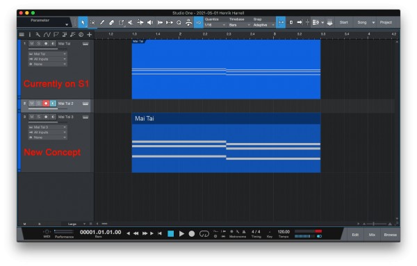
MIDI Regions

This just a concept but the "body" of the regions should have a 1px border-radius and it should be semi transparent (like 75% opacity with a 2px border of the same color but with 50% opacity) and the texts and the notes should be more thick with 90% opacity . Below you can see the resoult:

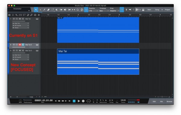
Then, when we select them (when they are in focus) the color should be 100% full opacity for all (body and notes)  and the border should be always 2px with a lighter color,  like shown below:
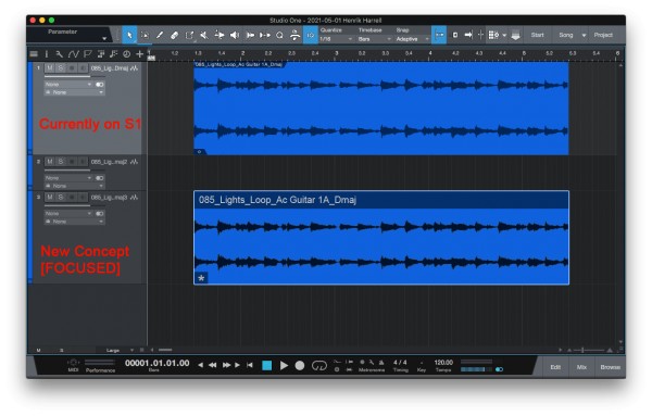
Audio Regions:

Pretty much the same concept, just need to make bigger the bottom left icons as shown below:

The "Focus" part is the same for the MIDI part:

What do you think about this concept? Let me know in the comments!

My thoughts:
I think that if it will be realized in this way it will be more userf-riendly and will make it more appeal.

Please vote if you liked the idea!

Thanks!

5 Answers

+5 votes
answered May 1, 2021 by adarshchandran (5,440 points)
Personally I feel the Track color highlighting (when the track is selected) has to be fixed and made more visible but these features that you mentioned are much much needed in their next update
+4 votes
answered May 1, 2021 by kbhpljpp (230 points)
you are not alone. O nce I found a lot of answeres but nothing is about the midi GUI. here I finally found it. really really hope that Afficials can see it and fix it.
+2 votes
answered May 7, 2021 by derylpresberry (1,390 points)
This needs more votes, considering reaching out to people in the facebook forums
0 votes
answered Nov 29, 2022 by princeagrawal (13,730 points)
Yes please. I had a similar request (link below) to make it easy to identify the selected event. But this idea is way more polished and better. But we do need a big overhaul to the graphics of S1 so that everything is easy to read and identify and aesthetically pleasing to the eyes as well.

https://answers.presonus.com/76586/better-visual-representation-of-selected-events
0 votes
answered Apr 26, 2023 by fsckdev (380 points)
MIDI part notes are way too small in the arranger, so much wasted space not having auto scaling of notes to fill the available track height.
...