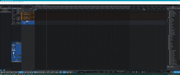
I feel that there is a bit of wasted screen real estate with the transport bar. Honestly, I think you could move the whole top bar down next to the transport and gain a bunch of arranger space. Now, not everybody has their transport to the side, and default is in the middle, but then there's wasted space on either side anyway. Currently, allinging the transport to any of the 3 options is purely aesthetic and the same amount of space is unusable.
As well as between the Video Player button and the transfers button.
There's all this space but when I open the the macro toolbar it opens another bar! Yes, I can have the bars undocked, and open them with a key command, easy.
I'm still expanding my workflow macros, and it doesn't take up a whole screen width yet, but I can imagine that some peoples do, it's not a problem that this opens up a new bar, but I end up with 3 rather thick bars that have empty space. If theses bars were modular, I could minimise the unused screen space.
In the mock up screen shot, all the white space up the top could be expanded into by the arranger.
The ability to move the bar into other 'docks' would maximise screen real estate for your workflow.