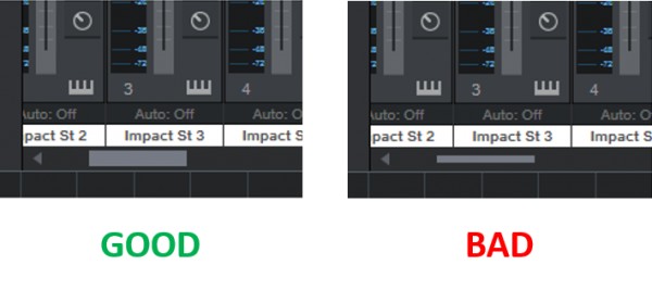
Since S1 v3, scrollbars and some volume faders have become too thin, which makes them considerably harder to aim for with the mouse than in earlier versions of S1. The new "narrow look" might look sleeker, but requires more dexterity. It's quite simple really: small/narrow objects are harder to aim for than large objects. In the following example, the fader on the right is thicker, so it's easier to aim for and results in improved UI ergonomics:

The following animated screenshot shows that, in practice, the 'hot area' of the GUI control actually extends beyond the visible confines of the control, so the functionality is there, but it's useless because users will naturally attempt to aim for the bit of the control they are able to see, not the bit that they cannot see! In the screen capture you can see how I some times I grab the fader, as intended, but other times I click too far off and end up grabbing the track header:

Same principle applies to scroll bars:

So make 'em thicker! Thanks