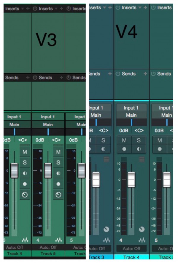
The layout of the Mixer has changed in Studio One 4 and I am so confused and really need to know the benefits of changing it into this.
First, the number which shows the fader volume should be right above (or beneath) the level meter (and it was on v3.5) but now there are ‘M S Mon Rec Buttons’ in between. There’s a huge gap between the two so it became very unintuitive. No other DAW is like this!
These 4 buttons are also robbing the space for the fader and the level meter.
When you turn on the new Note Pad (awesome feature!) the length of the fader and the meter gets even shorter.
It was understandable at least if the level meter gets wider like Cubase but it has got even thinner than before and because of this, the numbers written on the level meter has got less clarity than S1 3.
The result of all these changes, there’s just a huge dead space on the right side of the fader.
This new layout is illogical in many aspects.
Please put it back like it was in 3.5!