Questions & Answers

Expanded GUI Customization Options

+290 votes
2,907 views
asked Dec 30, 2015 in Studio One Feature Requests by Funkybot (21,570 points)
edited Mar 4, 2016 by Funkybot
I'd like to see the Appearance options in S1 V3 expanded to be more granular. To be specific, I can never quite get the colors the way I want in v3 because too many options are linked to too few controls. I'd like to see this expanded further. For instance, I'd like:

1. The ability to independently change the color of the Arrangement view, and the PRV, Console, and Edit views

2. The ability to change the contrast or highlight amount on selected items versus non selected items (right now, selected items are hard to see)

3. The ability to set different colors for menu bars, tracks, console channels, etc.

4. The ability to select less-subdued (pale) color options for clips/events/midi notes for more contrast there

Everyone can feel free to jump in and add anything I missed.

11 Answers

+1 vote
answered Dec 30, 2015 by AlexTinsley (924,980 points)
Thanks for the suggestion.

If anyone else agrees, or disagrees, please vote on it.
+14 votes
answered Dec 30, 2015 by niles (54,610 points)

Overall I think the colors of certain elements (e.g. tracks, notes etc.) are a little pale. It would be nice if we could saturate those to make them stand out. The line in Automation lanes for instance use intenser colors as the rest of the program. Those really stand out.

I would love to see independent colors for Arrangement and PRV too.


+4 votes
answered Dec 20, 2016 by chrisprovine (750 points)
First Post here!

I come from the 3d software world.  We often have deep control over the gui and the color schemes.  Seems like a small thing, but tiny, and sometimes drastic, color tweeks can have huge affects on a users working experience; long stretches of time starring into a monitor or 3.

Open up a color pallet that has LESS limitations.

Would be nice for many of us, but if not...well, Studio One will still be a winner.
+2 votes
answered Dec 26, 2017 by brconflict (2,040 points)

I just came from the unfortunate Gibson escapade where Cakewalk Sonar is no longer going to be supported or developed for. Thanks to the Studio One crew for the warm welcome! For this thread, I can say, coming from Sonar, the very first thing I was impressed with were the seriously resizable faders, something I'd begged CW for but never could gain any ground. However, what keeps me returning to Sonar is the 3-dimensional GUI, and a theme I worked for weeks creating. Studio One (forgive my criticism) has a very paper-flat interface that makes me feel I have to lean into it in order to feel part of it. Some of this is due to the strong colors that obscure features, small text in some places, a 2D vibe with fine, hard-to focus lines to separate functions/buttons, etc. It's easier on the eyes than Sonar's Tungsten theme, I'll grant. I think where Studio One simplified graphics in order to clean up the GUI, actually made some functions less obvious.

Colors are another thing I've noted right off. They're a bit too bold in almost every case, requiring Saturation adjustment, there's limited color choices, and not much in the way of customization. Layer colors are a bit overwhelming since they don't follow Global color settings.

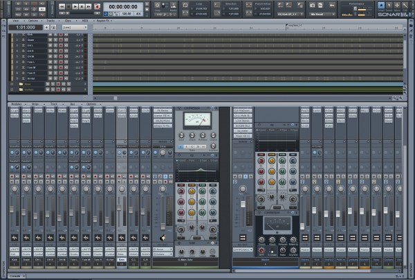
It does appear this is a highly requested avenue for Studio One, regarding custom colors and themes--maybe even graphics? CW released a really slick editor, which I was surprised at exactly how much could be customized. Now, this could be the result of doing things an old-fashioned way, but if you look at this pic, you can see what was possible. This was a theme I created in Sonar. Very easy on the eyes, and warm, even when using cold colors.

(Sidenote: Thanks to Presonus for allowing pictures to be uploaded directly! :)

+3 votes
answered Jan 28, 2018 by antokovacic (940 points)
I really appreciate the S1 design team, I'm grateful for this excellent DAW, and also greatful for the opportunity to express desires and feature request. That's very professional. I would agree with the GUI suggestions. S1 v3 GUI is not bad, but  it could be better. Summary:
- too dark, greyish and dull; watching it for hours makes me almost feeling depressed
- too flat
- GUI customization options limited and not too much useful
Dark-flat design obviously is a trend, it's "modern", but "modern" is not always better. IMHO, best is the golden middle: not too much fancy 3d, not too much flat. The DAW is a tool for making music, my eyes are watching it for hours every day, so this tool does have to be practical, smooth, comfortable and without any fatigue for eyes. If this goal is achieved, I don't care if its "modern" or not. IMHO, dark-flat, cold-metallic-greyish does not achieve this goal.
+2 votes
answered Mar 19, 2018 by tobiasarnold (810 points)
I would love two specific customization options in terms of the GUI:

- Bright color themes.

Currently, everything is kinda dark. I turned on inverted colors on Mac OSX for funsies and really enjoyed a bright looking Studio One! A lot friendlier, better for daylight ergonomics.

- More pseudo-3D elements / less flat UI design / better separation

Windows 8 introduced a simplified UI trend with flat colored areas and flat icons. It aims to save performance and be "modern". It was terrible, unergonomic and caused a lot of software developers to follow this design philosophy. The pseudo-3D elements make interactive elements clearly visible as "buttons" and add depth and separation for the eye to navigate complex UIs. And Studio One has a complex UI. I'd really want a less flat look for it. Please.
+1 vote
answered Sep 26, 2018 by baseliner (1,610 points)
i voted especially for your 2nd point:

2. The ability to change the contrast or highlight amount on selected items versus non selected items (right now, selected items are hard to see)

Selected items are still hard to see in Studio One 4 too.

I submitted a feature request because of this issue with the suggestion, to make sth. like the muted regions appearance,
only inverted colors of the names and perhaps a little icon at the bottom of the region would do it.
+2 votes
answered Jul 5, 2020 by ansolas (4,240 points)
The ability to increse the size and have a less narrow font would be nice either
0 votes
answered Dec 24, 2021 by kisnou (4,120 points)
I agree with you so much, I don't know why this is taking so long.
0 votes
answered Mar 19, 2023 by Michael1985 (12,890 points)
The major problem is the visibilty of not selected audio/MIDI clips at the vertical and horizontal border to other clips, especially when the grid is visble through the clips if activate in the options.

If you could change the color of the grid, and to have a more visible border, this would be very useful. maybe round white or black edges of every clip.
...