Questions & Answers

New feature: better visual representation of patterns

+20 votes
300 views
asked Aug 1, 2021 in Patterns by ekantjrgenbilling (460 points)

I would like to distinguish variations of patterns without giving much space to a pattern.

Usually, the patterns are represented like this ():

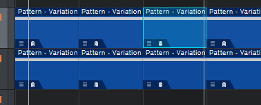
The most important information - I cannot see (the number of the variation).
The full title "Pattern - Variation" is almost unnecessary, I need in fact the number (or variation) of the pattern.

It would be very beneficial to have a visual representation like this (mockup)

1. The big number shows the number of the variation (the position of the variation in the list of all variations)
2. The title is much more "efficient": a small icon to emphasize the pattern and a shorter default for variation (or a custom value)

This enhancement would make working with patterns much more convenient - saving a lot of unnecessary constant scrolling...

Thank you for considering
Ekant

2 Answers

+2 votes
answered Aug 2, 2021 by Fornicras (2,090 points)
This would definitely be an improvement. I upvoted.
+1 vote
answered Oct 28, 2021 by realto619 (540 points)
edited Oct 28, 2021 by realto619

I agree that the way patterns are labeled is not very efficient. However, you do have the option to cut the default description more than in half. While you can't remove "Pattern" from a pattern variation, you can remove the "Variation" part. When you name them, replace "Variation" with something more descriptive and it will work better in the timeline.

As long as you don't reduce the pattern widths too drastically, they're still visible at a fairly reasonable size.

Your suggestion would be even more preferable, but hopefully this makes it a bit easier in the meantime...smiley


UPDATE: You can also change the Pattern label at the beginning by changing it here (screenshot below)


I upvoted as well... 

...