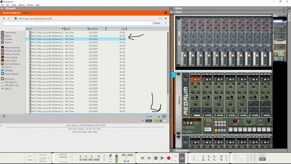
The browser needs some improvements that would help workflow for sample users by being hardwired to all sampled based instruments. When scrolling samples in Impact or Sample One we need to see a highlighted bar indicating which samples are to be selected as see the rest of the sample folder. As of right now when using arrow keys we're pretty much blind of which sample is coming up next or you having to try and keep count in the browser but with samples with similar names it's very hard to keep up.
