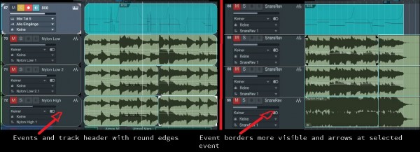
Make the edges of events&track headers and the playhead with a more contrasting color for a better border visibility(the color could be set in the options, some like red, some prefer a more smooth color a.s.o.)
The selected track header and the selected events could be marked with arrows at the edges of the events and track headers like you can see within the screenshot. Maybe these arrows could be a little bit smaller as in the screenshot.
If you could change these colors for event borders, selection arrows and playhead, everybody would be happy!
The playhead as example is very good visible, even if it stops.
On the picture you can see these two version, the first with round edges, the second just with blue lines around the events. (The color could be editable) The playhead as you can see has a purple color for good visibilty! But if you prefer white, you could change it.
