Questions & Answers

Hide or Redesign Toolbar in VST instruments, effects.

+16 votes
877 views
asked Dec 14, 2019 in Look and Feel by juliusjonker1 (1,420 points)

Lately I've been switching back and forth between using Studio One 4 and Ableton Live to produce my music. One of the joys of working within Ableton is the sleek and clean look & feel of the software.

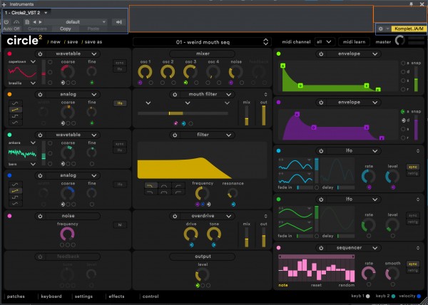
The layout of the Studio One toolbar is not optimal to say the least. Often it adds between 7% to 10% of height to the VST window while most of this space is not used/empty (functional space highlighted in blue, useless space in orange)
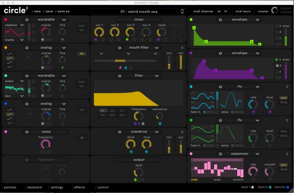
Compared to VST windows in Ableton, this is an eyesore to return to:
> In conclusion:

I suggest one of two options:
1. the toolbar is in need of a redesign with the functions being displayed in a more horizontal nature.
2. the option to hide the toolbar should be made available.

2 Answers

+1 vote
answered Jan 17, 2020 by davidviera1 (420 points)
Yesss please! Many of us work with small screens on laptops for example and is very need have space... Also I think that aestethic design...many plugins (as Bus Glue or Waves) are smaller than this toolbar, then a grey background covers the rest of the window...

Check the design of LOGIC or FL STUDIO...more clean about
0 votes
answered Jun 30 by davidvierabarreras (270 points)
Agreed with this, it seems not to be some complicated to implement, please presonus!!!! We need more clean view and gain this important space!
...