Questions & Answers

Simple yet effective visual improvements we need in Studio One 5.5! [Completed 7.0]

+199 votes
3,134 views
asked Jun 29, 2021 in Completed Feature Requests by kisnou (4,170 points)
edited Oct 12, 2024 by Lukas Ruschitzka

REQUEST: Better/larger view of midi events (1) and of automation lanes (2). Better resolution on automation points/fade ins & outs (3). 

1) enlightened It feels like the midi event has so much free space (above and below) that's not being used. It would help to use more space to have bigger midi notes. These are very wide chords but they give the idea of the complete opposite.

(Ableton might be a good reference)


2) enlightened Automation lanes.. Why so thin? They should eat more. Sometimes they are so thin it makes it harder to see them.

Example 1


Example 2 - Barely visible, right? But it's there, right below my cursor.


3) enlightenedAutomation points & fade ins/outs. Sometimes you have two automation points close to each other, you can't click the one you want to.
Requires a big zoom to then be able to click it. Same goes for fade ins/outs, if the fade in is very close to the end of the clip (or the fade out is very close to the beginning of the clip), you might have a hard time grabbing that fade point.
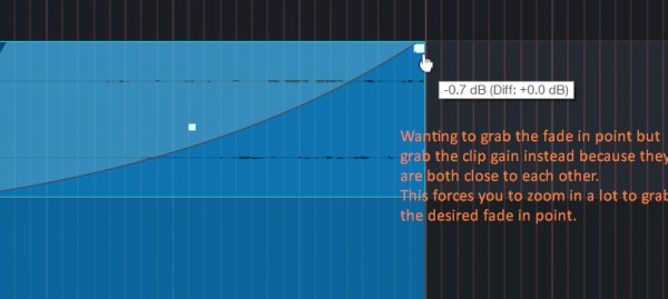


I would appreciate your vote on this. These are totally minor changes but they would improve the workflow SO much.
Hopefully we can see it happen soon!

14 Answers

0 votes
answered Oct 12, 2024 by Lukas Ruschitzka (261,300 points)
 
Best answer
Completed in 7.0
+2 votes
answered Jul 1, 2021 by arndkaiser (2,300 points)
Please read the rules before posting feature requests. One request per post, please. Other users won't know what to vote for if you put four different requests in one post.
0 votes
answered Jul 1, 2021 by kisnou (4,170 points)

Hello arndkaiser 

I removed the Pin selected channels in the console which was the most unrelated feature and will make a separate feature request for that.

However, I will keep these first 3 features in the same post as they are very similar and related to the same matter of 'Visual Improvements'. They are more similar than you may think, this is why I decided to include them in a unique post.

I am also 99% sure that if you agree with one of those 3, you will agree with all the remaining ones, as you might have faced the same problems while editing. There are no workarounds for these problems, no personal solutions, so I'm fairly sure that everyone will agree with all of these 3 feature requests.

+7 votes
answered Jul 2, 2021 by sintil8 (660 points)
Thanks for the request, makes sense and all three are good, the third is a real nightmare on a 17 inch monitor, and away from my large second montor screen, even then it can be a problem if you go to far moving a fade marker.

Cheers, best regards.

Sin
+2 votes
answered Jul 2, 2021 by kisnou (4,170 points)
I strongly agree with you Sintil.

I have a 27" 2K monitor and that third problem is always annoying. No matter what size your monitor is, I believe that is a universal problem which needs to be addressed asap.
+1 vote
answered Aug 5, 2021 by taylorscott2 (4,300 points)
For the third problem, hover your mouse a little bit to the side of the the fade automation point. Your mouse will be on top of the actual fade line, but you can grab there to move the automation point. It looks weird because you aren't actually grabbing the point, but it works!

Voted
+1 vote
answered Aug 8, 2021 by kisnou (4,170 points)

 Hey taylorscott2

Thanks for the help! Though I was aware of that, and exactly that behaviour isn't really the best.. To me, It's hard to think that behaviour is handy, because sometimes you really have to make such minimal movements to get it right..

+1 vote
answered Sep 22, 2021 by lago1 (520 points)
I feel like this is an issue related to screen resolution. My automation lines are MUCH bigger and very clearly visible. I have a 1080p monitor.
+1 vote
answered Sep 22, 2021 by kisnou (4,170 points)
hey lago1, you might have a smaller screen, but I'm sure you can agree with me that 2K resolution monitors are becoming more and more widespread and I can't scale down the resolution just for that. However, I had the issue with a 27" monitor and with a 32". If there's a problem with the resolution it's not due to the user but to Presonus.

This is such a simple fix that it wouldn't even need a feature request, but I had to, because the automation lines on 2K screen are very very thin.
–2 votes
answered Nov 19, 2021 by artjohnson (1,370 points)
Maybe it's just me, but I use a 49" 5K 1440 monitor and I see everything just fine. Of course, I might hafta zoom something here and there. As to automation dots running over each other, it happens. Still, I use the Reduction Level setting (Start/Advanced/Automation) to adjust how clustered or clean I prefer automation to look under varying circumstance.
+1 vote
answered Nov 28, 2021 by kisnou (4,170 points)

Hey artjohnson, yes you said correctly that it might be just you, since I am 99% sure most of us do not have (and probably cannot afford) a 49" 5K monitor ahah :P


+1 vote
answered Dec 24, 2021 by kisnou (4,170 points)
I don't know who is downvoting my comments but it would be nice to hear your opinions :)
+1 vote
answered Jul 16, 2022 by vtqhjbdw (440 points)
I strongly agree with you
+1 vote
answered Mar 19, 2023 by Michael1985 (13,030 points)
the automation would be much better visible if they would have color below them like the clip volume automations.
...