Hi there,
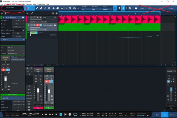
Sometimes I'm using Studio One on my old Surface Pro 4 and while it's running great and all, there's one small issue - because of the screen size and Windows scaling factor, Studio One decides to hide half of the parameter automation & mapping panel in the upper-left corner of the screen, but it still shows the Start / Song / Project / Show buttons that I never - or very rarely - use.
Can you please add a setting to hide those buttons, either in the menus up top or somewhere in Settings?
Here's how it looks, with quarter of the top bar "wasted" for rarely used buttons:

Thanks for considering it!
Best regards,
Artur