Questions & Answers

Problem Mostly Solved! (CUSTOM DRUM GRID EDITOR - Made Screenshots of Idea Attached!)

+1 vote
1,936 views
asked Dec 1, 2022 in MIDI Editing by viccapota (1,100 points)
edited Jan 17 by viccapota

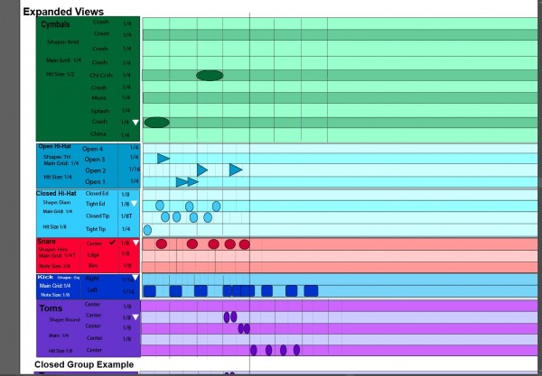
Here is a snapshot below this text of what i meant as to badly needed versatility on drum editing the needed pattern editor and visuals especially needed for those who need to produce extremely complex drum beats for deathcore and aliencore or any very involved and drum-busy music for that matter.  But also need quick shortcut modifiers per row too so you can just say click - on the secondary division for the articulation, then it goes to a smaller value and + clicking would make it go to a larger vale.  hit T while clicking on a row to get triplet division for that row. and the same to undo it.  And same for the Main Division on the left. But this way you have so much versatility to place notes on main and secondary grids that overlay with each other and even if you change the value of the main grid or the secondary articulation-based grid per row, you can still place the note on either grid...  this way you can have a triplet 16th  6 hit thing happening in a beat on the third beat but the second and 1st beat you can have quarter and eighth.  (Rather than being boxed in on the pattern editor).   You are simply not boxed in.

But what is key is that you can quickly adjust a main beat grid division (dark grey line) and secondary grid division (lightest grey line) just per group.  But then if you click on the name or the articulation you then go to a window that gives you a page for the Note value lets say click Kick Right then you see a window that says for C1 you  change the name of the articulation. As for the mapping the drum software takes care of what hit is triggered.

The White Triangle Drops down and expands the group but if you click in another row in that column then it makes that other articulation the focus of the group if you close the group to one hit view.

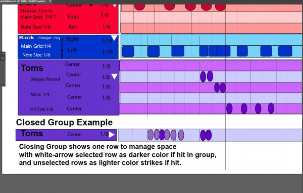
You can see the bottom closed group example if the tom group was closed - then the articulation row that the white triangle was placed on is the only hit visible when the group is collapsed to one note view.  Just if a person wants so simplify the view a bit and rush a quick beat then access the other articulations to fine tune it later.

What can be custom labeled is the articulation names.

Below the title of the group lets sat snare,  you have the shape selector,  and the main grid size for that group. Then even the note size selection if need be.  But you can have a secondary grid size per articulation row. And for denser grids one would select a smaller note size.   But all this stuff allows for complete versatility that you can change grids within grids. Because the secondary grid per row changeable allows you to insert the notes that way and then when you change it it doesnt change the note placement.  

Also labeling of all articulations is custom.   As for the note sizes... just nice for long sounding crashes but doing so to anything would extend and would have to only visually layer for any long notes placed slightly after and "on top of" long notes  but not audibly obviously as you gotta make sure the software doesn't polyphony the layers. Its just visual layers.

All this allows much greater versatility than being boxed in with a boxed in feel with the pattern editor.

Also a fine tuned click quantize feature would be nice so it just slightly randomizes as you click on the fly but quantizing so if you click a bit to the right it only slightly puts it to the right. 

As for velocity views the existing velocity views are fine but i am not sure how it would integrate so merely adding the existing simple velocity stuff would be ideal.

(Later edited original message to show closer views and ideas for closed groups to row and selected row darker color if hit, and unselected showing lighter color hits if other hits in the group not under white arrow focus are struck. but clicking in the grid on a closed group strikes the white-arrow selected hit.  When group open (white arrow down, then all hits on that group's grid become darker strikes.  But un-focused hits only becomes lighter when one row is shown in closed group view to manage space.
8 Answers

0 votes
answered Dec 1, 2022 by viccapota (1,100 points)

I meant holding minus key - while clicking on the note value (either on the main note division grid or the articulation based in dividual rows for the secondary grids. And same with holding T for triplet on and off, and lets say the period key for dotted. Just to be on the fly. But it would be ery proper if you hold ALT along with that then can do it for everything in that group. And adding another modifier key can do it for every singledrum group and its articulation  - this can go for either the main grid, the secondary grid set per articulation row, or the note size visual and shape.

Another matter to note here is if you look close at the Closed high hat articulations group, you will notice that while the main grid is set to quarter, notes, because the bottom articulation is set to the same the light grey lines dissappear, but in the second one from the bottom "closed tip" there is a triplet version of 1/8th notes to set that grid.  But if you insert notes then remove it, then the notes stay there in their intended place because to vary other beats of the same with non-triplet based.

But what is also extremely important is that a modifier key can allow you to place the note exactly where you click the mouse if you wish and not always limited to insert into any grid. All this is just more free placement regardless if That would be the final touch so that you are not boxed into a grid which is just so unnatural in the existing pattern editor.  It kind of makes it like "Slip mode" in pro tools.

Also this view maintains the keyboard roll for those who find it more natural. Although the colors should probably be more subtle for the darker shaded blacklight for the black keys

As for the shape selector its not crucial for me but just an idea for customization.

And finally, in this example the kicks secondary subdivisions are 1/16th notes but I made the error here of not adding the text what would indicate it for those rows. 

0 votes
answered Apr 24, 2023 by viccapota (1,100 points)
edited Apr 24, 2023 by viccapota

I was hoping that there would be some progress towards this matter.  I may have overdid it with the shape options but here is a close up of the concept so you see better what is going on... if you look at each articulation line you could be able to modify the increments and sub division. (and shortcut modifiers to be able to do so per each articulation would be amazing. And if you look closely there would be even lighter (or in night more 'less bright') sub-divided lines within rows... and not just to triplet or bigger or smaller increment, but ideally also dotted etc...  But as for the shapes, even a circle or square or just one shape is sufficient.  but obviously more shapes would be nice. but thats not absolutely crucial.  What is crucial is the flexibility in being able to sub-sub divide the grid and have this visual aid because drum editing is very difficult and we badly need this.  any are frustrated with very limited drum pattern editors in all daws.

0 votes
answered Apr 26, 2023 by viccapota (1,100 points)
edited Apr 26, 2023 by viccapota

(Later edited original message to show closer views and ideas for closed groups to row and selected row darker color if hit, and unselected showing lighter color hits if other hits in the group not under white arrow focus are struck. but clicking in the grid on a closed group strikes the white-arrow selected hit.  When group open (white arrow down, then all hits on that group's grid become darker strikes.  But un-focused hits only becomes lighter when one row is shown in closed group view to manage space.)

+1 vote
answered Jun 30, 2023 by gh.productions (2,880 points)

You’ve got my vote! I’ve also got a feature request that I need your vote on: https://answers.presonus.com/76617/midi-notation-mute-automation-request

My request is designed to simplify the process of editing the notation used for VST instrument arrangements. Once implemented, there would be no need for manual splitting of MIDI events or note-by-note muting of MIDI notation on the piano roll. This feature is especially handy for repetitive music like EDM, rap, and other electronica, but can be used in any genre where VST instruments are used.

Instead of being limited to manually splitting MIDI events and/or having to go into the piano roll of each individual instrument track to edit MIDI notation, users will have the additional option to automate the “MIDI Mute” Button that already exists on each VST Instrument Track: https://drive.google.com/file/d/1fC7Bktj8XS3--Ys8jNHb9U1w6Irej14M/view?usp=sharing

I put together a short video of me attempting to mimic what the process would look like in real time. Please share the above short and simple video with anyone else you know that would like to get Studio One to work faster and better. Bear in mind, we are all currently unable to recall or save ANY of the MIDI Mute button activity shown in this example…because the “MIDI Mute” button is currently not automatable for whatever reason:

After watching this video, think about how much time it would save to be able to automate “MIDI Mute” compared to having to manually split and mute MIDI events and/or notation from the piano roll to accomplish this same task! Even if you don’t see yourself using this feature, it deserves your vote by virtue of it being a button in a DAW that can’t be automated!?! This is a DAW… all buttons should be automatable, right!?!

The first part of the video also highlights the audible difference between “MIDI Mute” and “Audio Mute”, as the two parameters serve entirely different functions. “MIDI Mute” controls the reading of VST Instrument notation, while “Audio Mute” is effectively a sound man, turning your microphone on and off.

In summary, the current workflow of having to manually split and mute MIDI events parts and/or notation just doesn’t feel natural and takes forever. Having the option to automate the VST Instrument Track “MIDI Mute” button to bring different parts in and out in one take on-the-fly for multiple instrument parts simultaneously will not only be more intuitive, it will also be an exponential time saver!

Add your vote for this exponentially time saving feature on the Presonus feature request page:

https://answers.presonus.com/76617/midi-notation-mute-automation-request

0 votes
answered Jan 6 by viccapota (1,100 points)
edited Jan 6 by viccapota

Thank you for the vote gh.productions!!!  Finally someone who gets it .  My initial problem was just overdoing it with shapes.   But many people are not understanding that that is not the point of this major exposition. This concept doesn't even need all the shapes. even one or two shape types is fine like the rounded square hits or the circles.  But the main gist of this alot ofpeople are not bothering to try to digest and that is why unfortunately sometimes the real gems dont get alot of votes. 

Many "producers that make beats" dont understand the grid-fluidity equivalent of drumming need in general because they are not drummers themselves and many who are just making hip hop or EDM simply do not understand how fluid and intuitive a drum pattern editor really needs to be if we are to try to quickly write drums. Especially with the oncoming competition of Ai making music.  We still need to be able to maximize our abilities.  But most Studio Producers are simply not either 1) drummers or 2) band mambers who have bands where someone other than the drummer writes the drums or 3) bands that dont currently have a drummer. So they wouldn't know why this is so crucial.  But I can assure you this is my best contribution to the DAW industry in terms of an idea. 

 For my needs, there is a very simplifies version of my request which may seem overwhelming to some people whoa re new to this or to writing complex drum parts:   caps only used for clarity not anger... so please dont mind them but this request is simply for  1) VERTICAL ARTICULATION-BASED COMPARTMENTALIZED EXPANSION - to both easily be able to lay it down quick and simple in hidden mode for one or more articulation groups.... but also the option to instantly be able to unhide expandable depths of the  articulation groups if we want to have it all displayed and intelligently sub-grouped and color coded/opacity coded... but also visually pleasing enough withouth being distracting..  but also 2) HORIZONTAL RHYTHM-BASED COMPARTMNTALIZED EXPANSION as assigned grid division per articulation group set (or go back to simple one grid assigned mode for all articulations..)  .  We need ultimate drum pattern freedom, intuitively simple articulation access (come on everybody read this carefully... its like opening a certain toolkit in a shop for work)!  

 I will subscribe to Studio one again if this ever implemented!  I have no use for the software right now as much as I am trying to find use. (except for an occasional subscription to get my virus control OS for my old  Access Virus Ti2 going).. 

 I can accomplish a bit of this on the Avid Pro Tools Midi Piano grid and how i group the drums but doesnt have that articulation expansion thing, but rhythmically i can adjust the grid very fast on the fly at least. 

0 votes
answered Jan 9 by viccapota (1,100 points)
edited Jan 9 by viccapota

Finally, here is a screenshot of how i try to do it in Pro Tools but still not treally satisfying - there is no intelligent hiding/expanding process of articulation groups.. its either displaying single hits, or annoyingly needing to resize the midi drum tracks in order to try to access articulations. expansion of articulation groups. 

http://answers.presonus.com/?qa=blob&qa_blobid=14944773286040436912

 (And yes there is some of that articulation dropdown in Toontrack stuff but not intelligently and the grid is just awful and doesnt match what a proper DAW grid should look like... unless that has been changed by now i made them the request a half a year ago).

0 votes
answered Jan 15 by viccapota (1,100 points)
If this is too complex can you guys lease allow custom colorization of midi note by whatever we wish on the entire keyboard?  Millions of people have already requested this so why isn't even a simple request like that being implemented so that we can at least have all our drum types one color group... i.e. - all snares one color, kicks another color, hats another color, and all cymbals another color and same with toms.   So many people have requested this and none of this gets implemented. Why is this?
0 votes
answered Jan 17 by viccapota (1,100 points)
Ok Problem solved good enough with latest version of drum view. its reasonable and I will accept. Thanks for doing something reasonably close to my request!
...