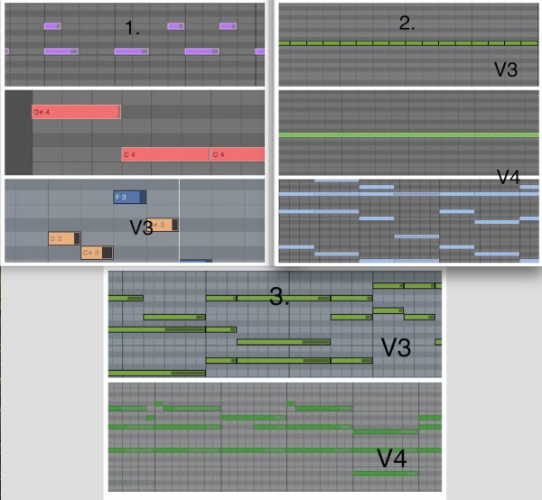
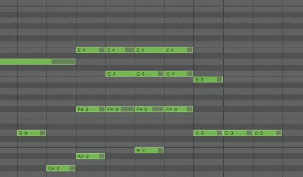
In Studio One 4, the appearance of the midi notes in Piano Roll have changed. This causes following issues.
1. All notes looks like its slightly off to the left.
2. Difficult to see the borders between adjacent notes.
3. Overall clarity is worse than before.
4. Hard to find the overlapped notes.

4. It's so difficult to find it and it's almost impossible to see the length of overlapped notes.

My request is to surround midi notes with thick black edges like it was in v3. Or to add an option like ‘enable black rims’ in the Note Color options.
Thanks.