Questions & Answers

Improved grid and clip drawing

+49 votes
753 views
asked Mar 4, 2016 in Studio One Feature Requests by fransvannispen (5,910 points)

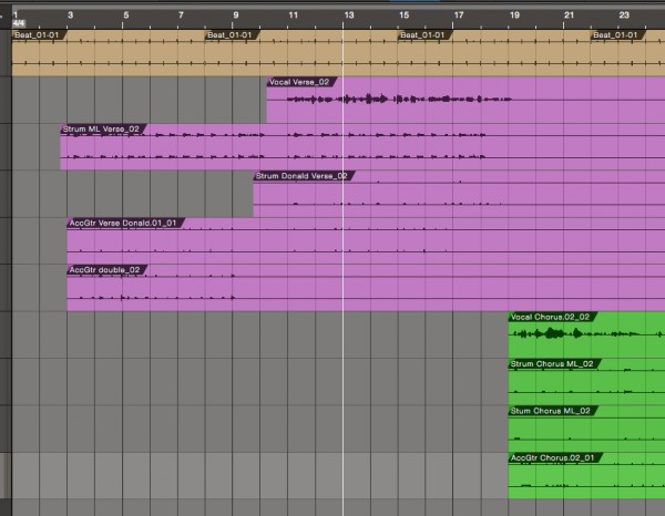
I would like to see improved rendering (drawing on screen) of the grid and clip outlines. It is very, very hard to see the difference between the beat and bar grid lines at the moment. Maybe by having a color slider and a slider which sets the luminance difference between the beat and bar lines.

Also, the clips on a track should have a clear outline, as now you can barely see the separation between clips. Especially if you have several identical clips copied after each other. Maybe emboss it a bit more, or have the option to define your own emboss level. A simple outline would also work just fine.

This is S1 3:
 

Same on PT12:
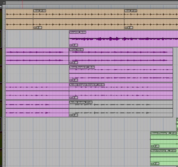
Notice how you can instantly see the bars on PT and have totally no clue at all where you're at in S1.

2 Answers

+1 vote
answered Mar 5, 2016 by fransvannispen (5,910 points)
Close but not quite. I do not just want improved contrast on the guides. Yes you can play a bit with the background color and contrast to make the guides stand out a bit more, but it removes your possibility to set your own background setting, as the only way to make it stand out a bit more is to leave it all at 0. And even then it's hard to see.

I would like to be able to set a different color for the grid lines. Preferably separated for both the bar and beat lines.

And the other one is not about wave drawing, but the clip background. Just make a few tracks in S1 give them the same color and cut some clips on each track. You can hardly see the different tracks and clips as there is no clear outline on the clips.
...