I tried Notion 6 for some hours and I didn't find it pleasurable work with it. However, I must say that I have not used other products like Sibelius, so I can't compare it to the industry's usability standard. Here are my thoughts:
Note duration
The first thing I tried was to enter notes with particular lengths.
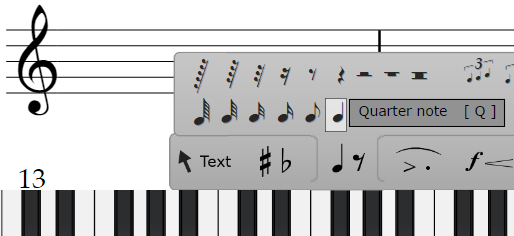
- Option 1: select the notes on the menu.

Remember Fitt's Law: "...the time to acquire a target [with the mouse] is a function of the distance to and size of the target". And the distance is large and the targets are tiny. So you have to slow down in order to select the note length. This is not very pleasurable to work with and thus this was not really an option for me.
- Option 2: shortcuts. The shortcuts correspond to the literal letters on the keyboard (w = whole notes), which is an odd design choice in my opinion. When I use shortcuts I don't look at the letter (I don't use "f" in a computer game to go forward and "b" to go backward). The big problem is the half notes which need the letter H which is far away from the rest (and normally pressed with the right hand). This is as if pitches don't lie next to each other on the piano.
- Suggestions: provide simpler alternatives:
- e.g. "d" makes them a note shorter and "f" makes it longer
- and/or: Cmd + arrow down makes notes shorter and Cmd + arrow up makes them longer.
- or: put them at least in order next to each other on the keyboard.
- and: Cmd + Mouswheel makes notes either longer or shorter.
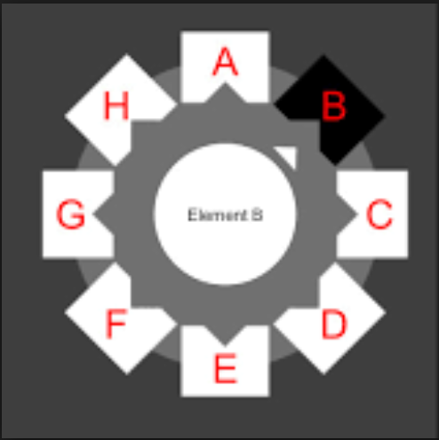
- or: make a selection-wheel that opens up depending on the shortcut (a wheel for note length, a wheel for velocities,...)

- Also: every shortcut that is used often should be in range for the left hand (a right-hand option would be nice too) so that it is possible to use the mouse with the right hand.
Entering chords
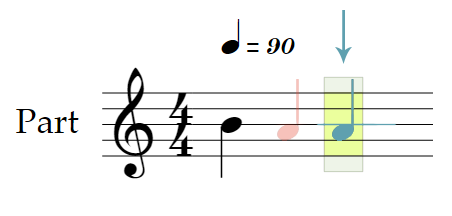
Look at the following example. Here, I start out with only one Note (B) and want to add an A after this (blue). My mouse is on the blue position, but the note is entered on the red position:

This means that I have to move the mouse horizontally back to the note just to make a chord. It would be nice if the selection and the note stayed on the same position (at least as long as long as I don't move the mouse too far horizontally) so that I only need to move vertically to add notes.
There is also a cognitive component to this. Very often entering a note seems to alter the layout, which is confusing. Look at the following example:

Here I enter a note between notes (red arrow) and after this the whole layout changes (1 -> 2). After this I am a bit confused and must reorient myself. Initially, I don't even know where my mouse pointer is.
Visual feedback
It would be nice to have more visual feedback. Look at the following situation:

I want to insert a chord note but instead, I entered a sequential note. There is no visual feedback beforehand that says whether I make a chord note or a sequential note. This is particularly a problem when I start to make the chord with a new sequential note and the new note is slightly positioned in front or after my mouse cursor which makes be believe that I am about to add a chord note.
Suggestion:
- Provide feedback and make the system more forgiving by making the selection area larger (Fitt's law).
- One possible solution would be to make all neighbor notes move slightly to the side so that the (horizontal) empty space around a chord or between chords gets temporarily larger as I hover over it (similar to a horizontal magnifying glass). This makes things easier to click and besides it would also give visual feedback about what I am about to do.
- Or: like the vertical snapping (pitches) it would be nice to have horizontal snapping as well (maybe enabled through a shortcut).
Changing the note duration
One of the first things I tried was to alter the duration of a note. While it was easy to shift the pitch of a note with the arrow keys, I couldn't find a way to alter the duration. Intiailly, the only way I found was to use the mouse :-O. Fitt's Law again: the smaller the target, the longer it takes to click it!
After some time I found in the help menu that "=" followed by the note duration shortcut can be used for this. This is completely inscrutable to me. First, I don't really understand the meaning of the "=" interaction (is it just to change the duration?). Second, it is a sequential interaction (1. Shift+0 (-> "=" on the german layout) then 2. note duration). Third, there is no visual feedback that "=" led to entering a duration change mode. Fourth, why making a "=" shortcut in the first place?
Entering notes with the keyboard
I don't know how long it took me to enter notes with the keyboard and I still don't know how to enter chords. The method I found was to go in step mode and to literally enter the note names like "c" for the note C. Again, I don't get this literal design decision.
I then remembered that Guitar Pro had the possibility to write notation and tried that. So much easier (at least extremely beginner friendly)! It didn't even took me a minute to figure it out. Also, it is quite easy to change the note duration. There is a simple tooltip that says +/- and it works! I can't say much about Guitar Pro's notation usability, but judging from the few minutes I played with it, it's keyboard input is so much easier.
Overall:
- The first impression of Notin 6 was quite good because entering notes with the mouse is easy. But then it's in the details.
- Focus on the 80/20 rule: in 80% of the time, we use 20% of the features. These features should be extremely easy to work with
- Let the users define shortcuts!
- Don't think too literal when it comes to shortcuts. Think about the range of the fingers and about which action usually come after each other. Every important shortcut should be easily available with the left hand (when working with the mouse). Do I really have to switch to the mouse-tool with the Esc key? I think Adobe uses the v-key.
- Define standards for Notion and Studio One.
- Make the system more forgiving. Example:

Here, my mouse is in the position of the red dot and I want to select the note. But this is only possible if I click the black dot of the note (or the line :-O -> Fitt's law again). It would be nice if there was an area around the mouse (like a brush) that makes nearby notes light up as a sign that I can select them even though I am not exactly hovering over them. I think this would vastly improve the user experience as this makes things so much more convenient.
I suggest starting with improving the mouse interaction which is quite appealing to new users and has much already much potential in the current form. Cmd + mouse-wheel to change the duration, Alt + mouse-wheel to change the velocity, etc. of notes would be a great start. Changing existing notes could be done with the same interaction "Selecting note(s)" -> Cmd + mouse wheel. Then focus on the keyboard interaction. Maybe start by making an input mode like Guitar Pro, which is really easy to use for beginners. Once the intuitive features are in place that lure new users into using the software, provide features that allow them to work faster and more efficiently.