Actually I don't like the way multi part editing is display/controlled in Studio One so I don't think one hotkey (that you don't know if you don't read it in the manual or in forum threads) makes it less confusing.
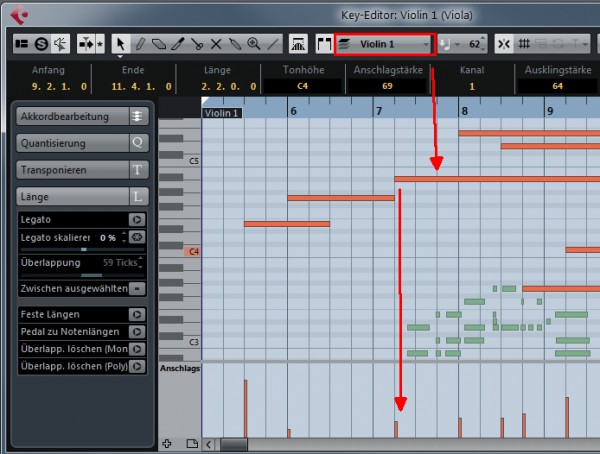
I really like how it's done in Cubase:

You just have one dropdown list that contains all selected events and you can easily selected that one you want to edit. The track list in the editor is a useful thing but all those different symbols (white circle, pensil, italic) makes it very confusing. For me a simple list like in Cubase would be much smarter.