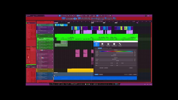
This might seem like a trivial feature, but the customizability of S1 was what initially switched me over from Logic. That being said, I've never been a fan of the brighter colors because it's looks more like a white tint over the whole screen. I'd like to know what other people have to say, but I think this can be remedied by a separate luminance slider for the areas highlighted in red on the attached screenshot.
I find these colors help with creativity (even installed the color toolbar) and this would be a nice quality of life improvement.

A color wheel would be pretty nice too, but... baby steps :)